Awwwards


Hippoland

Hippoland header

Project type:

E-commerce, Web

Services:

Web Design,
UI/UX Consultation

Client:

Hippoland is one of the biggest brand hypermarkets for babies and kids goods in Bulgaria. They have stores in almost all major cities and sell more than 20 000 different products. The project was realized while working with Stenik Group

SEE ONLINE

Project goals

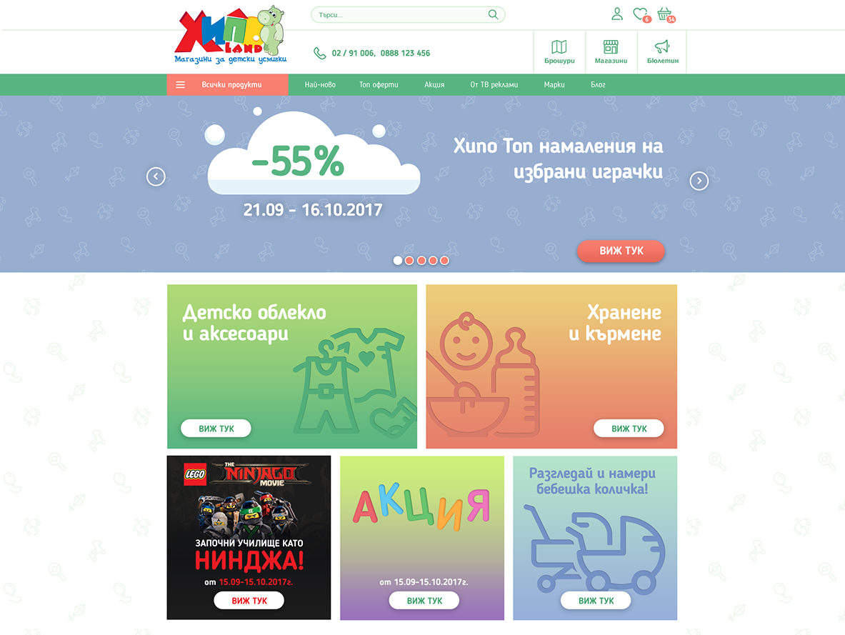
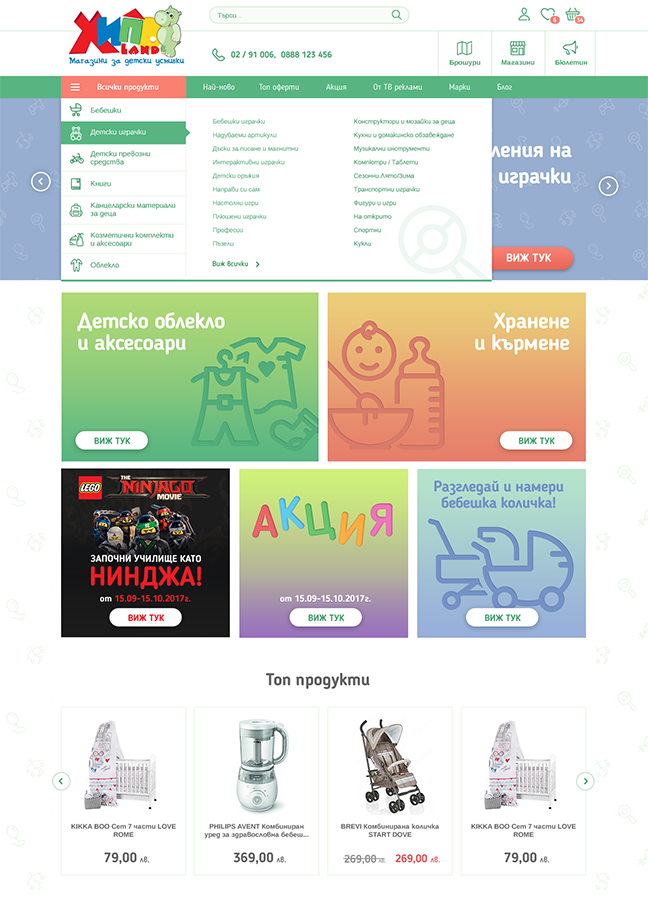
The previous hippoland website was a few years old, and badly needed to be re-designed. The goal of the project was not only visual aesthetics but also to give more information about physical stores, greater user awareness of promotions and online brochures, and ultimately increased conversion rate.
Hippoland Goals
01

Solutions

1 / 6
  • hippoland listing page

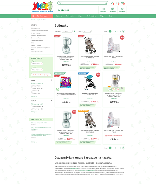
    One of the big challenges in Product Listing page was to not make product box too overloaded with content. Hippoland has a lot of product labels, and a product can have multiple at the same time, so a solution was to have them as thin and horizontal as possible, so they stack up easily. Additional mandatory information about promotions has pushed us into taking out call-to-action shortcut buttons, make them appear over a light overlay during mouseover.

  • Hippoland product details page

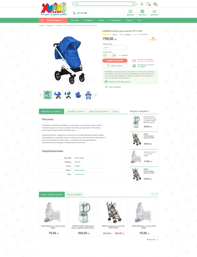
    Product Details page also uses heavy-rounded form fields and in this way gives gentle and kid-friendly feeling. Mandatory elements for every product are a lot, that's why they were separated in 2 columns - left one for price, options, quantity and buttons, and right for delivery info, instructions and promotion discounts.

  • Hippoland Checkout

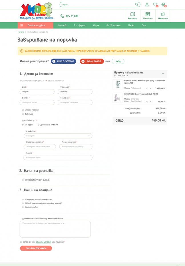
    Clear one-page checkout is solution we offered to the client. It also included right side sticky summary of order products and total price. Analytics show that percentage of abandoned shopping bag has decreased and convertion rate increased.

Hippoland All pages