Awwwards


Stenik Group

Stenik Header

Project type:

Corporate Website. Portfolio.

Services:

Visual & UI design.

Client:

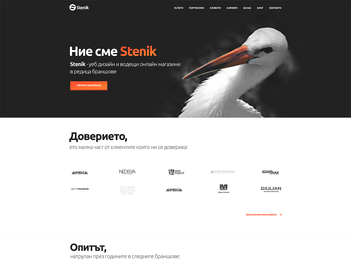
Corporate web design for one of the leading e-commerce web agencies in Bulgaria. Stenik Group has more than 15 years experience and around 1000 projects. They offer development and support services using Magento platform and certified specialists.

SEE ONLINE

Project goals

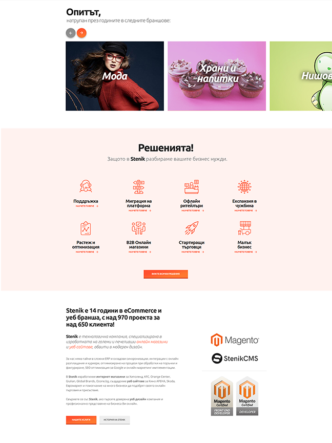
The main goal of the new redesign was to show company's projects in interesting way. The website had a lot of content so it needed more visual elements to retain user's attention. Having hundreds of projects, an easy way to navigate through them had to be offered. Overall look should have been clean and typography needed improvement in order to reflect the company's leading position in the e-commerce market.
Stenik Goals
01

Solutions

1 / 6
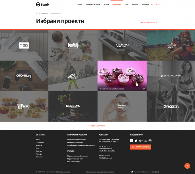
  • Stenik Top Projects page

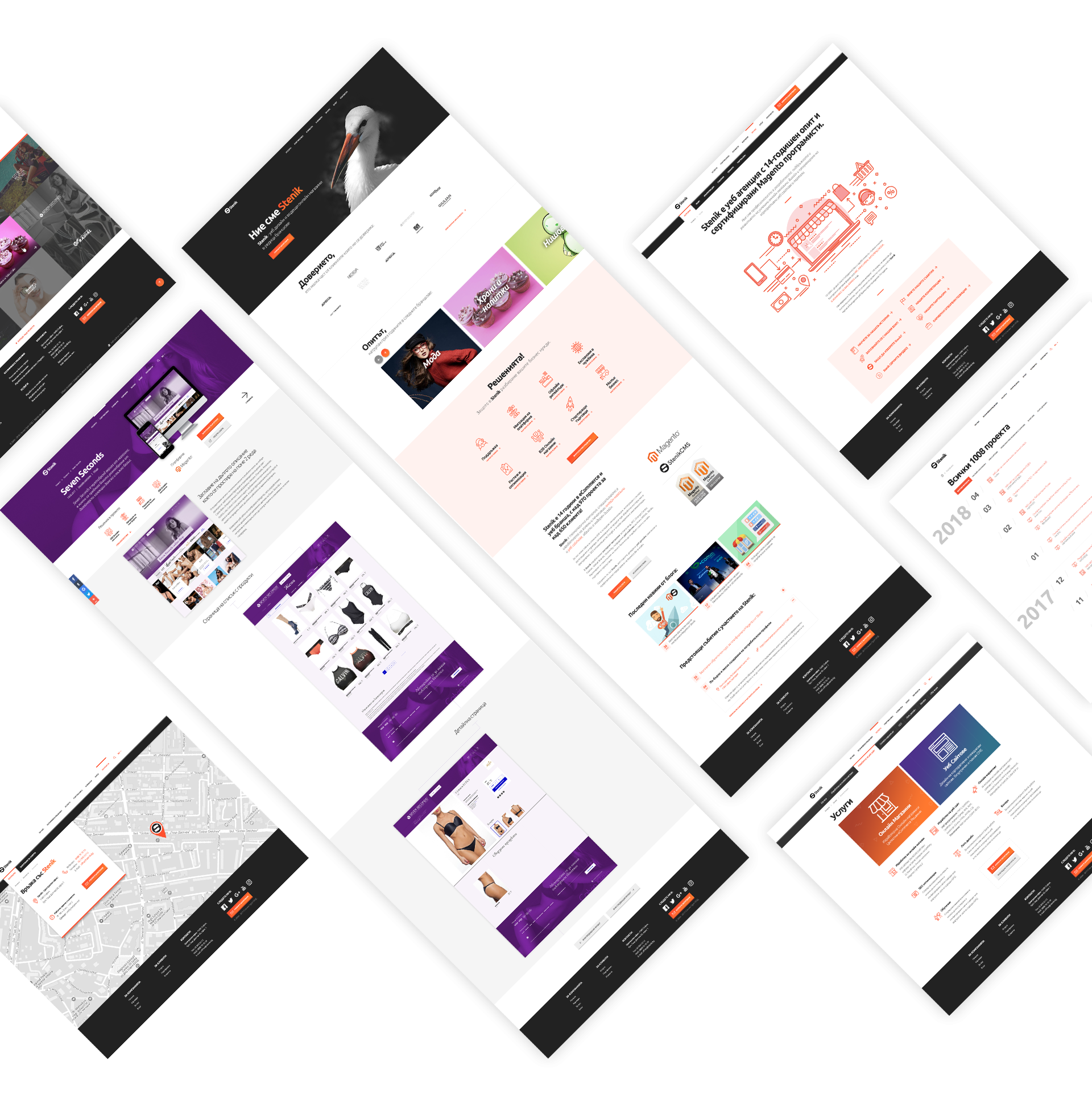
    The main challenge for this design was how to present company's top project in a clean but informative way. Ofcourse having so many work during years, we had to present just some of them and offer an option to load more on demand, Another thing that gives authority and proffesional feeling for the agency is to put the logos of the big brands on top of each project's image.

  • Stenik Project Details page

    Project details page was designed stylishly to include different header background, related to the project. On the front it has the desktop and responsive version respectively in iMac display or mobile phone. Another visually pleasing solution was to list all the services with their icons used in the services page.

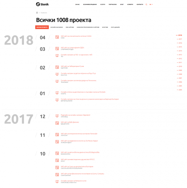
  • Stenik All Projects page.

    The company wanted to show the vast number of project they have finished during years. This is another challenge that the CEO had vision about it and I manifest it visually - having this sort of tree like structure, similar to mobile contact book. The year stays sticky until you reach the next one. Also there's a convinient sticky navigation on the right to choose a particular year. Thus users can get imediately the feeling for a lot of business experience and hard work.

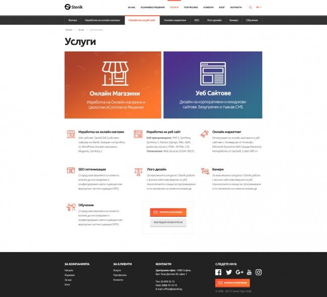
  • Stenik Services page

    Services page relied heavily on icons to bring visual interest. The main services offered are two - e-commerce and corporate websites. That's why we separated the content space in two and put big banner for each of them. Finally we used one of the small service content boxes to insert call-to-action buttons, thus catching user's attention while scanning. This also filled the empty space caused by not having count of services divided by three.

Stenik All Screens