Awwwards


Ozone.bg

Ozone header

Project type:

Online shop

Services:

Web Design,
UI/UX

Client:

Ozone is a famous online shop brand for entertainment and accessories. Their main type of products are gaming and computer related, but also have a lot of toys, gadgets, puzzles, books etc. The project was realized while working with Stenik Group

SEE ONLINE

Project goals

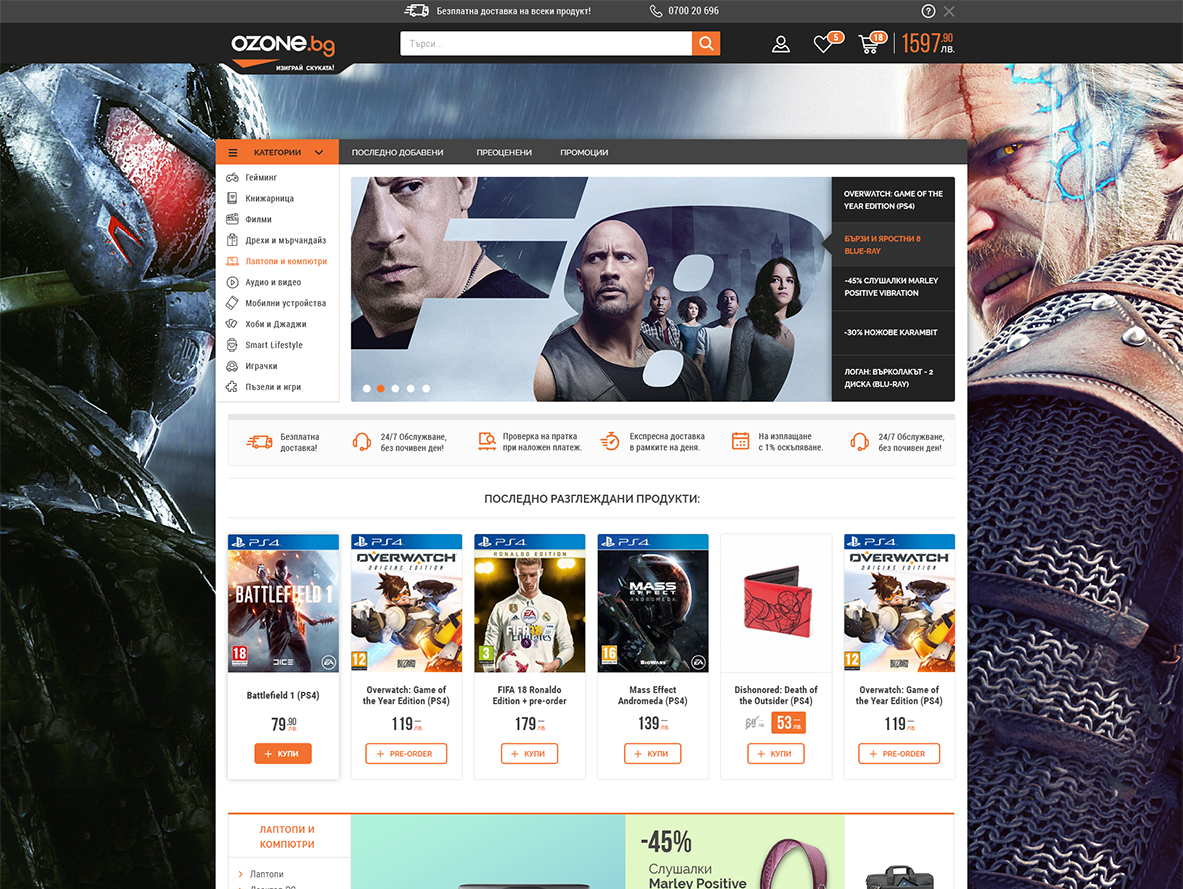
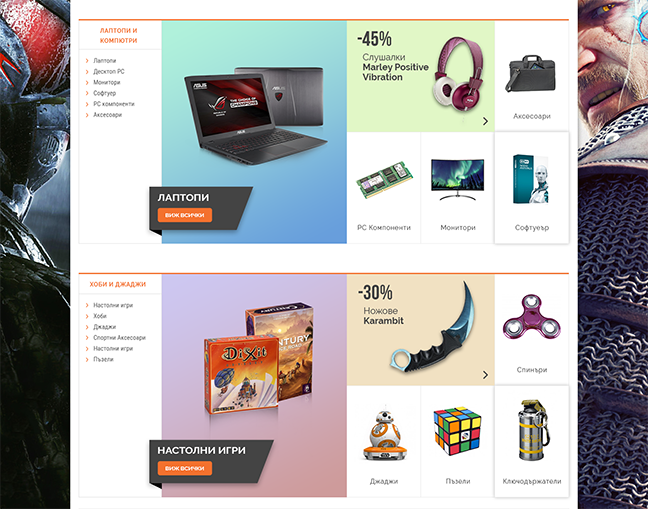
Ozone needed a new look that's up to date. Of course it was challenge redesigning a store with so many daily customers, in a way that won't make users think they are landing on a completely different brand website. That's why there were some limitations as for example using very similar typefaces. Another thing was to find a way to display big part of the category hierarchy in an emphasized way on the homepage. Finally the listing should include lots of products fitting in a viewport and many CTA buttons.
Ozone Goals
01

Solutions

1 / 6
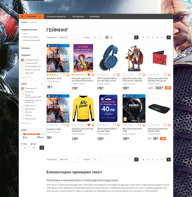
  • Ozone listing page

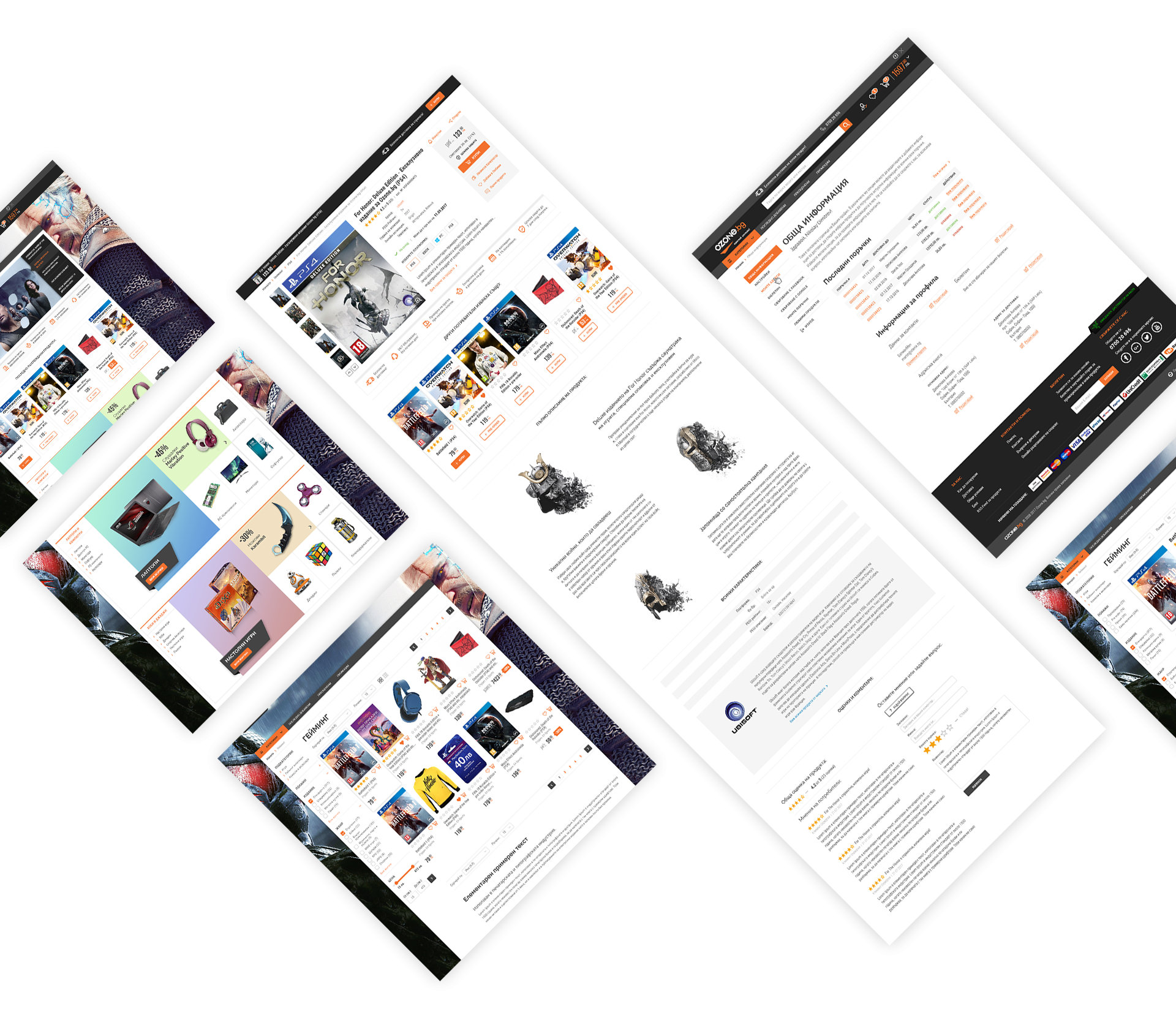
    One of the big challenges in this project was to fit 5 products in a row, but mantain 1280px width of the grid, so that the layout looks same on small laptops' resolution too. The solution was to use icons with no text for call-to-action buttons, as they are easily recognized e-commerce symbols. Also everything in the product box was left-aligned thus using the space optimally. Throughout the website there had to be an option for background banner, so we had to design the main content in a way that background could show up more from top and sides on bigger resolutions.

  • Ozone.bg details page.

    Product details page is very rich in content and some decisions are taken because of this fact. For example the buy box is emphasized on the right because of many additional actions and buttons, but also because product description and attributes take a lot of space thus pushing the box further down. Displaying of the product variations was made with clickable button-like options, instead of standart dropdown and in this way user can see all of them at a glance. Having a lot of games and movies products on the site, the full description part had to include graphics for retaining user interest. A Z-pattern was used for displaying the content and right after that the attributes and reviews are included. Instead of using tabs, everything is listed so the user won't miss important info.

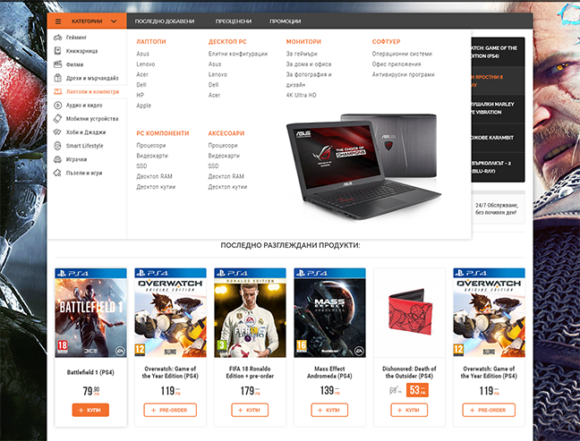
  • Ozone Megamenu

    Having a huge amount of categories, we had to implement a megamenu. We used thin icons for further differentiating of main categories, and then column separation for the next level. Adding a visual in the right-bottom corner is also a nice way to make the menu more memorable.

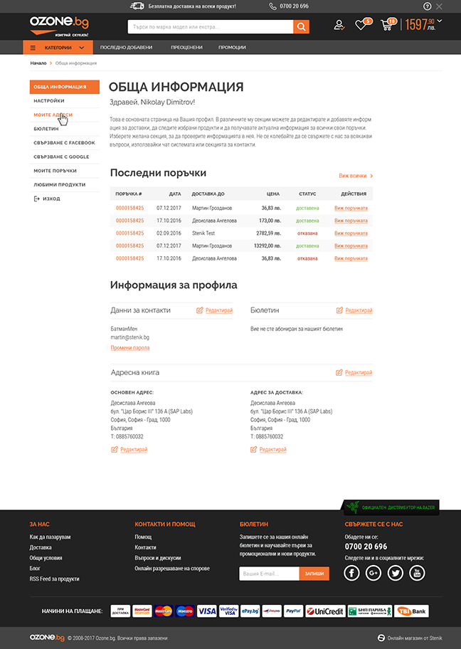
  • Ozone - My account page

    In the my account's page, I used different layout for the left navigation so it's more prominent. Again using icons for actions and good alignment of elements were the key for a good delivery of information.

Ozone - All Screens