SIKO
Project type:
E-commerce, Web
Services:
Web Redesign
Client:
SIKO is a chain of more than 15 shops across the country, selling interior and construction materials. They are leader in sales in the field of bath interior with over 28 years experience. The brand has a wide variety of stock, importing from more than 30 foreign manufacturers. The project was realized while working with Stenik Group
Project goals
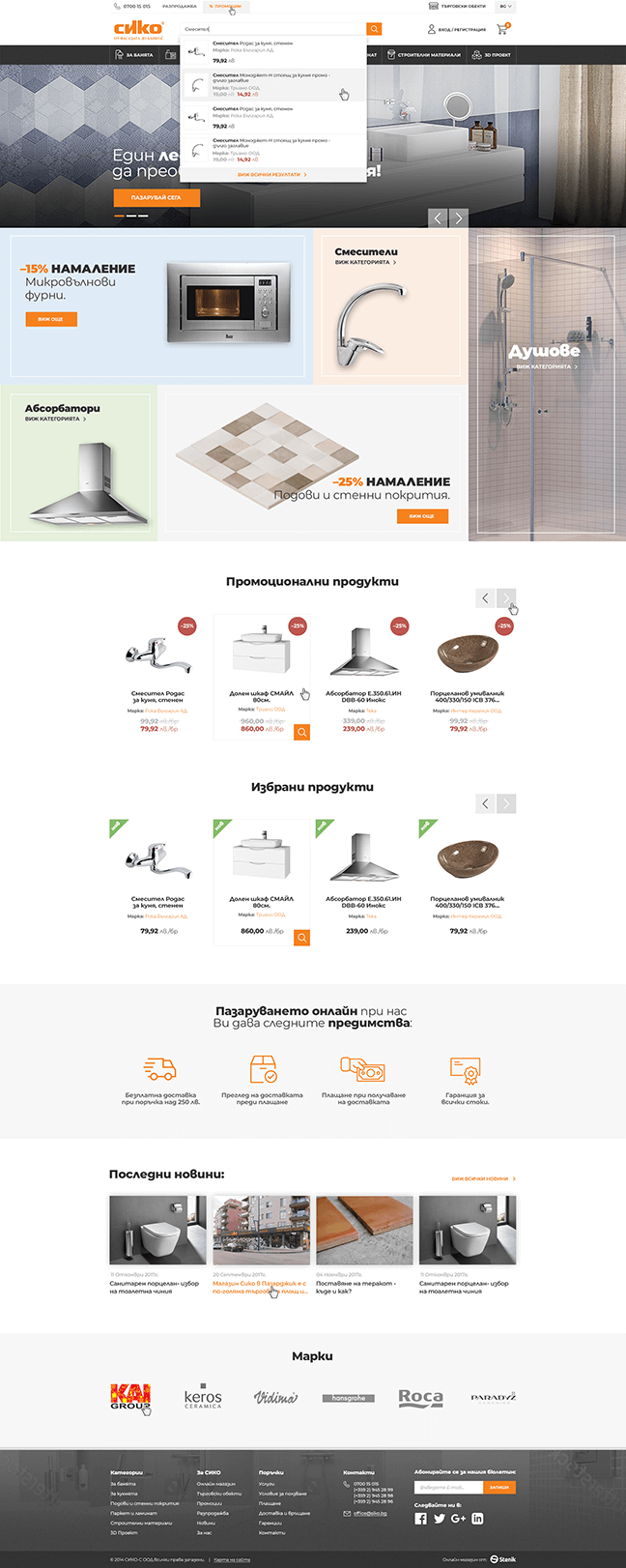
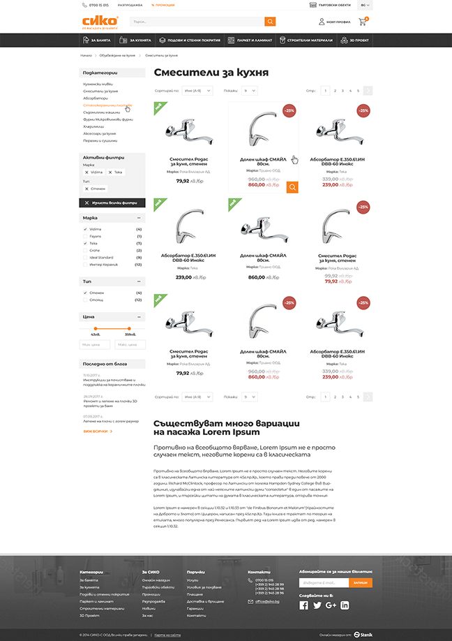
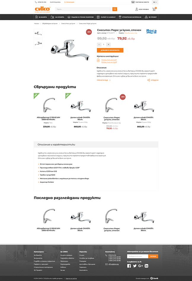
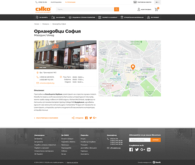
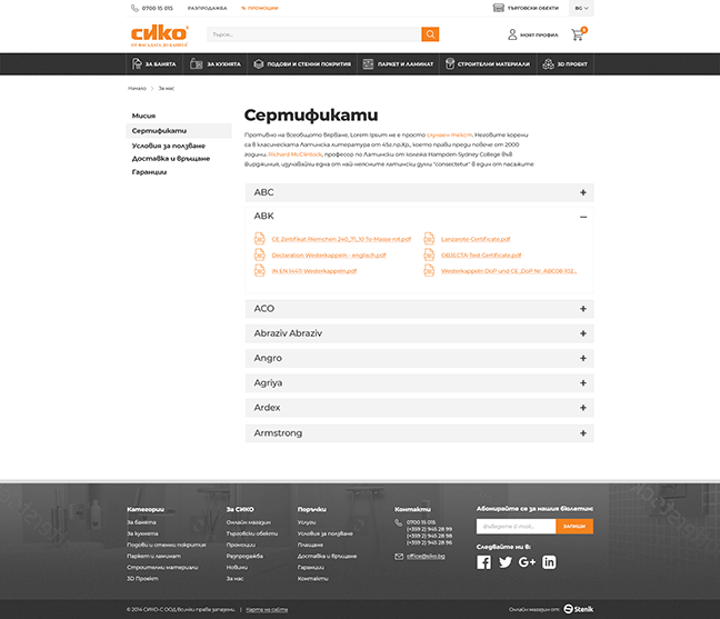
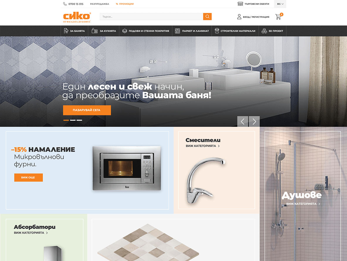
Having so many products and categories we had to improve basic Magento search with an additional module, that showed search suggestions, and needed good and clean design in order for user to see everything at a glance. The brand has many physical stores around the country so it was important to make a good looking store details page with basic info, location and gallery. I chose Montserrat for this project as it has nice round geometric feeling fitting the brands sphere of business. Also this type has released Bulgarian Cyrillic, which looks amazing! I applied the puzzle of tiles type of grid for banner block here. I thought it's pretty suitable for this brand because one of their main category of products is bath interior and terracotta.
